REDESIGN PENDASI
Pendasi is an iOS app that can provide recommendations to assist in preparing and tracking a baby's MPASI (complementary feeding) for parents with babies aged 6-12 months by generating various ingredient combinations based on the baby’s age. See the study case here.
Role
OVERVIEW
In the Pendasi app that we developed before, we are grateful for the positive feedback. But, we acknowledge that some users still don't feel full happiness and find the app less visually appealing. To improve this, I plan to work on the app's colors, illustrations, and copywriting to better convey the app's intended atmosphere. Additionally, improvements to the visual hierarchy and clarity by using visual design principles will be implemented to ensure users have a clearer understanding of the information that is shown in the app. Additionally, our team did not create a style guide, leading to inconsistency in the design elements. In this redesign phase, I also plan to conduct A/B testing. In summary, I'm going to focus on making Pendasi's look and feel better, so it's easier to use and more enjoyable. The aim is to make parents feel comfortable using the app and happy about the help it provides for feeding their babies.
PROBLEM
Visitors struggle to comprehend the data displayed
The visual isn't making them feel happy and engaged

HOW TO IMPROVE
Delightful Color Scheme
Expressive Illustration
Improved Copywriting
Enhanced Visual hierarchy and Clarity
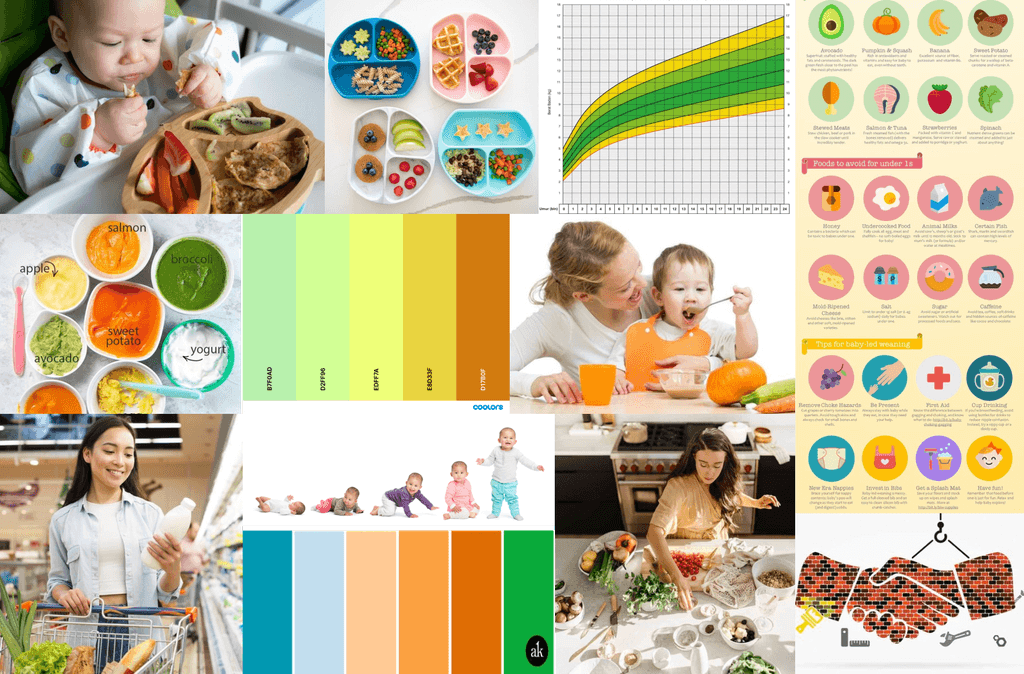
Creating Moodboard
Creating a mood board is a crucial step in visual design as it facilitates consensus on the style and conveys the intended feelings or values of the product. In the case of Pendasi, where the goal is to provide recommendations for preparing and tracking a baby's MPASI, the desired user experience revolves around eliciting feelings of happiness, healthiness, and trust.
Happy
I want users to feel happy when using the Pendasi app because the app is designed to make the process of providing and planning meals for their babies a joyful and positive experience.
Healthy
The goal is for users to perceive a sense of healthiness while using the Pendasi app.
Trust
Establishing trust with users is paramount for Pendasi, and this trust is built on the app's commitment to providing meals that directly impact the health of their babies.
Style Guide
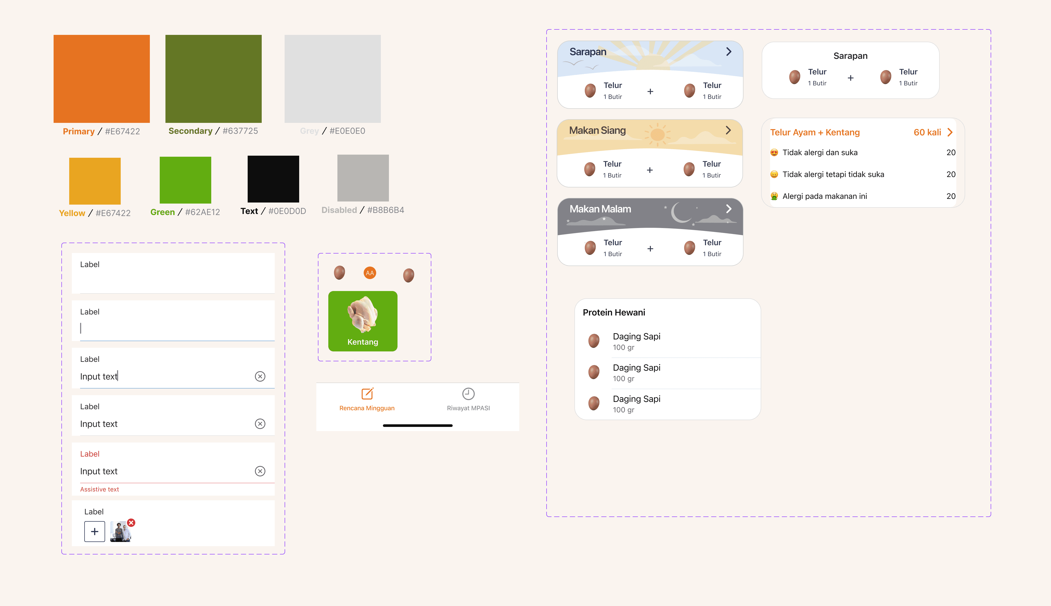
Creating a style guide is a crucial step to ensure consistency across the visual elements and components of the Pendasi app.
Design
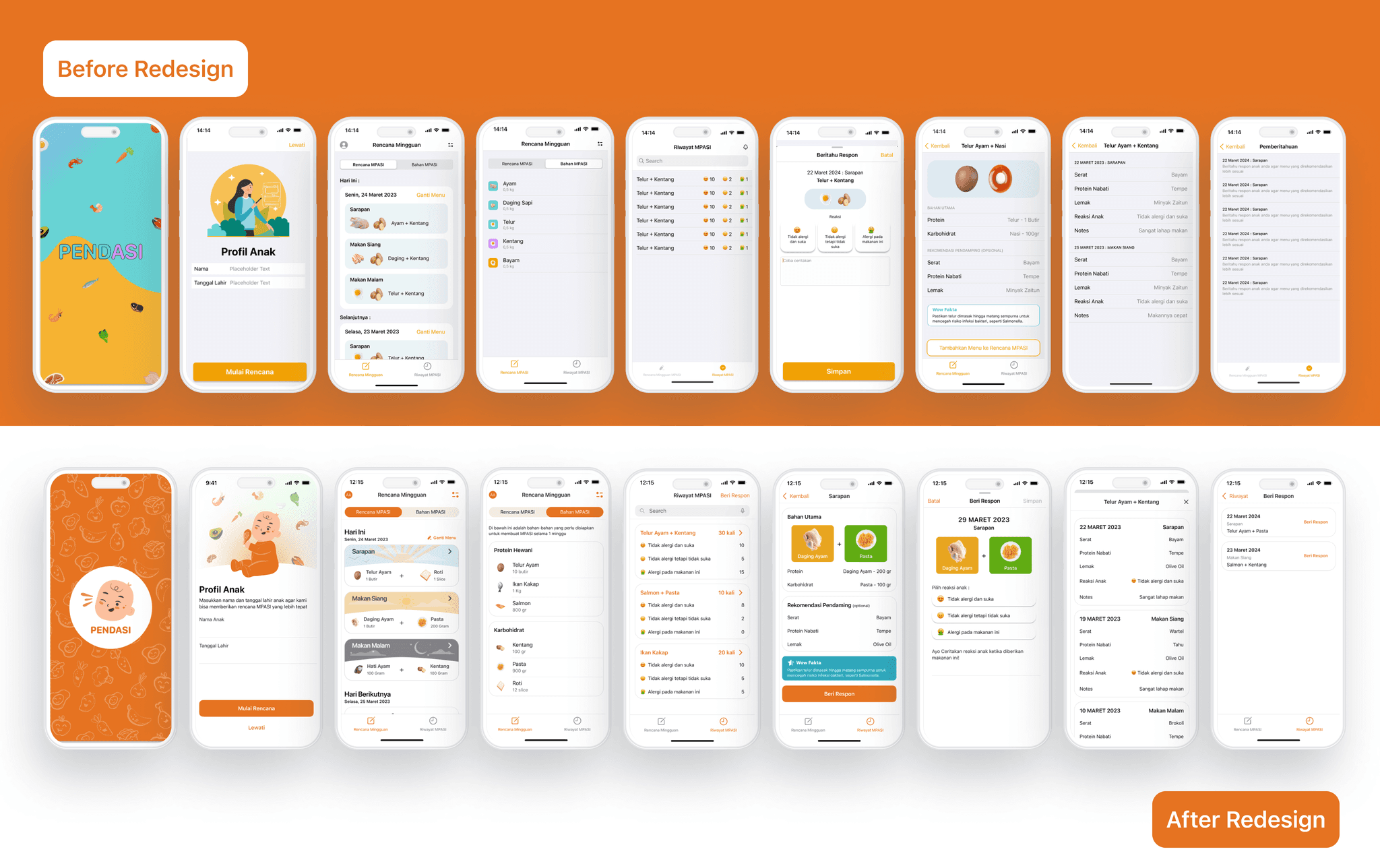
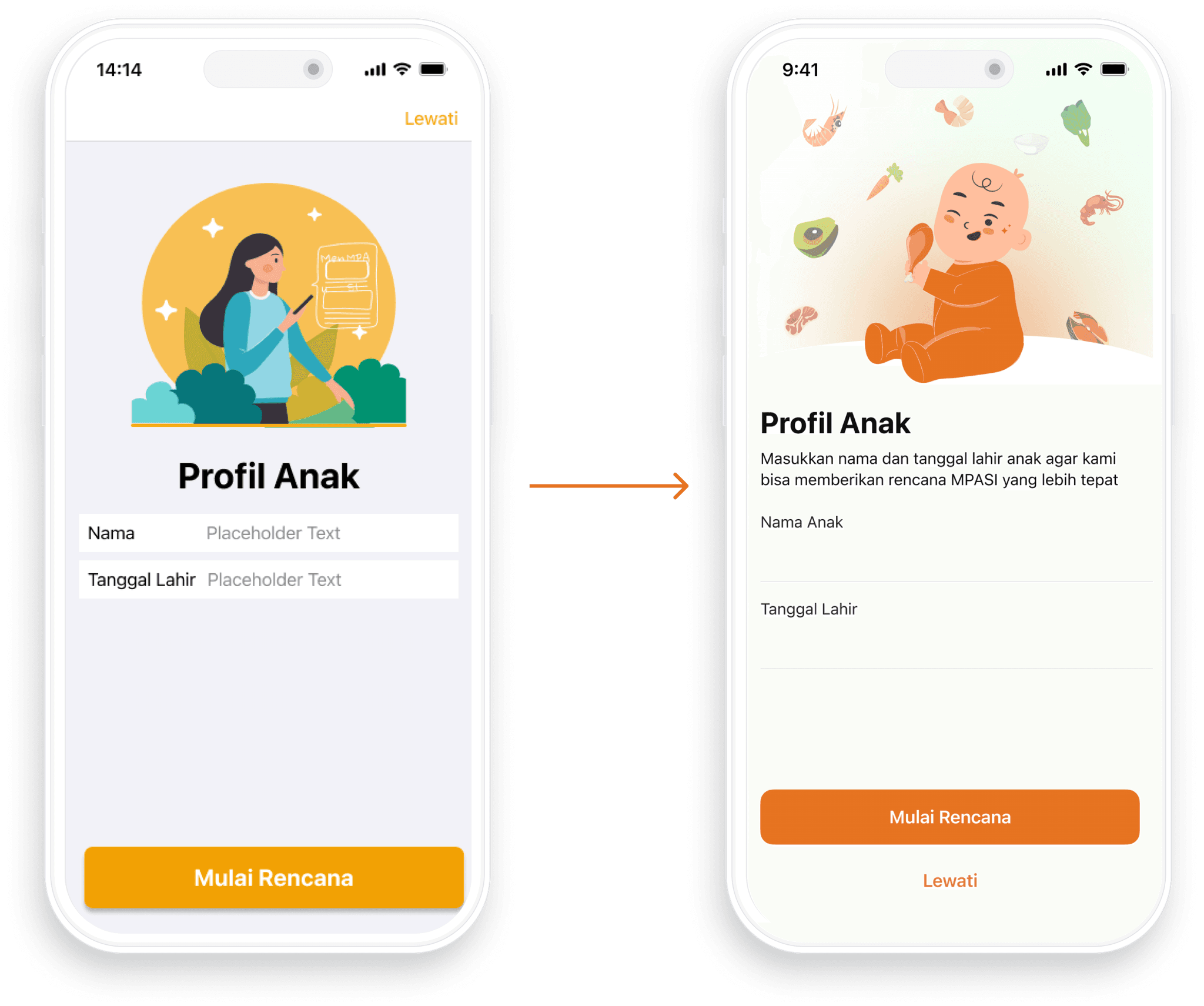
PROFIL ANAK
Updated The color scheme for better contrast
Add Incorporated expressive illustrations to foster a cheerful ambiance.
Descriptive text to ensure that the information easily understandable
Improved information hierarchy ensures a more organized layout.
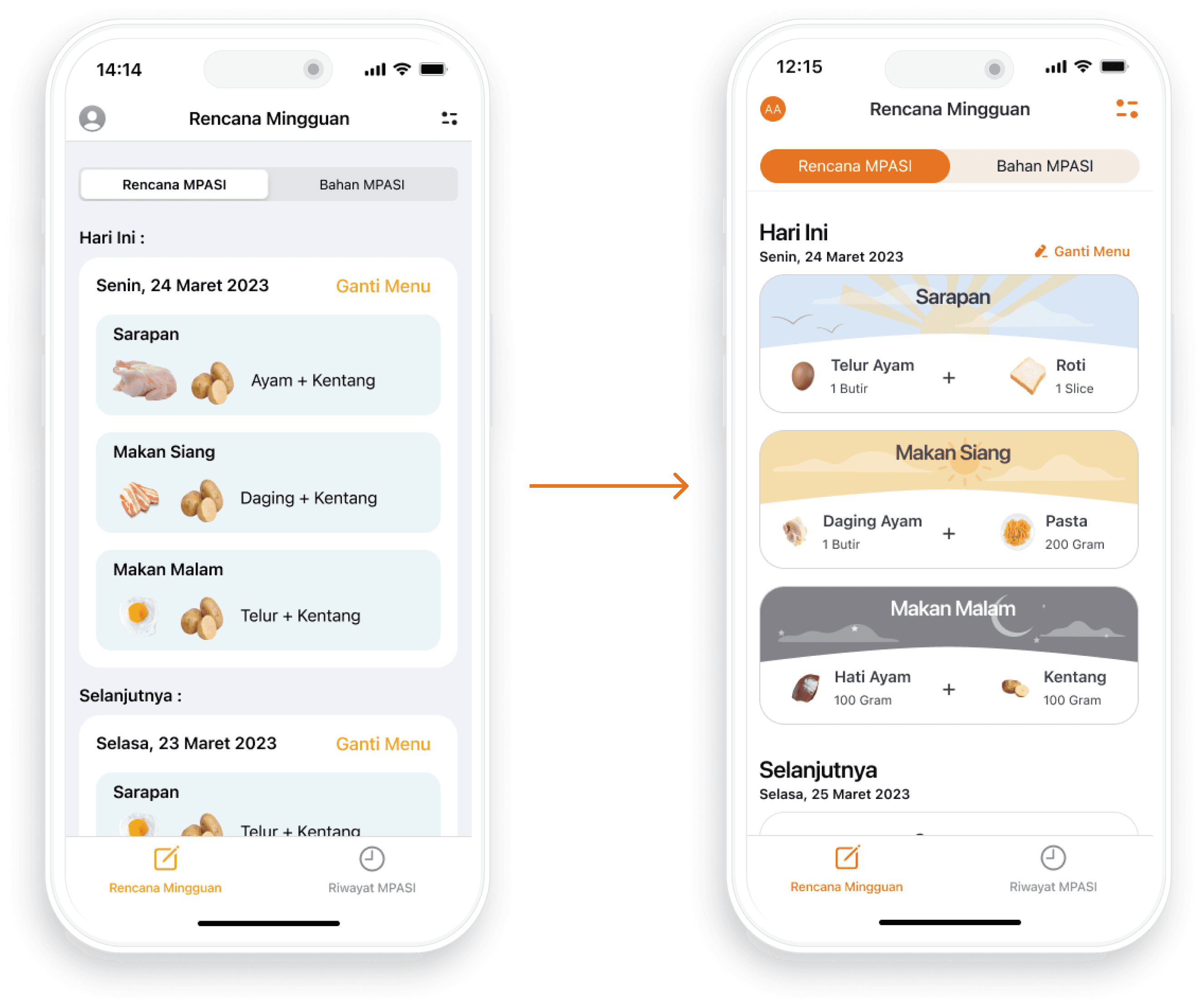
RENCANA MPASI
The addition of custom illustrations infuses a cheerful atmosphere.
Provide details about the quantity of ingredients required
To maintain consistency, the term "Selanjutnya" was replaced with "Hari berikutnya".
Improved information hierarchy and layout ensure a more organized and user-friendly interface
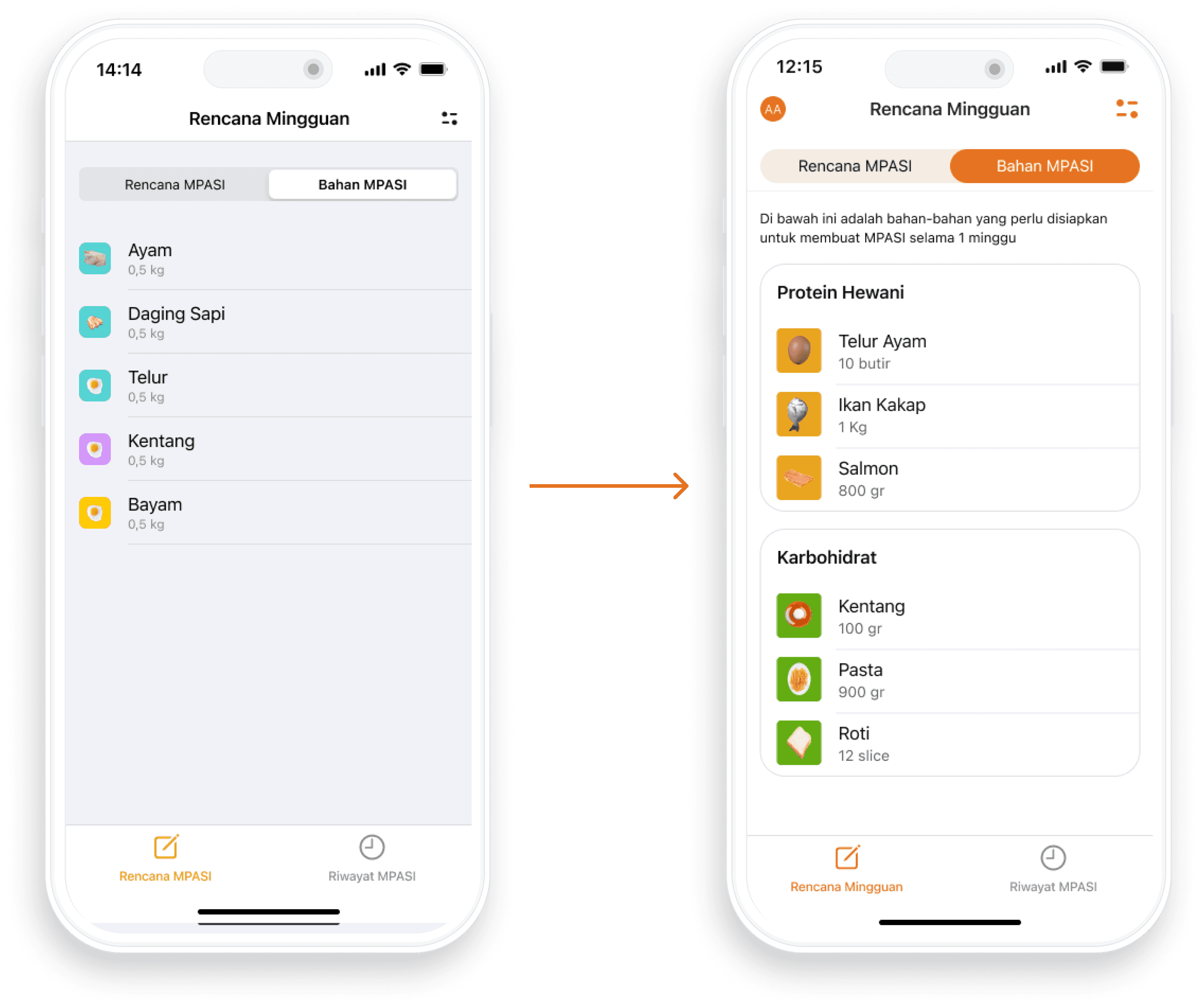
BAHAN MPASI
Add Descriptive text to enhance understanding
Improved the layout for easy comprehension
Categorized information for clarity and more organized
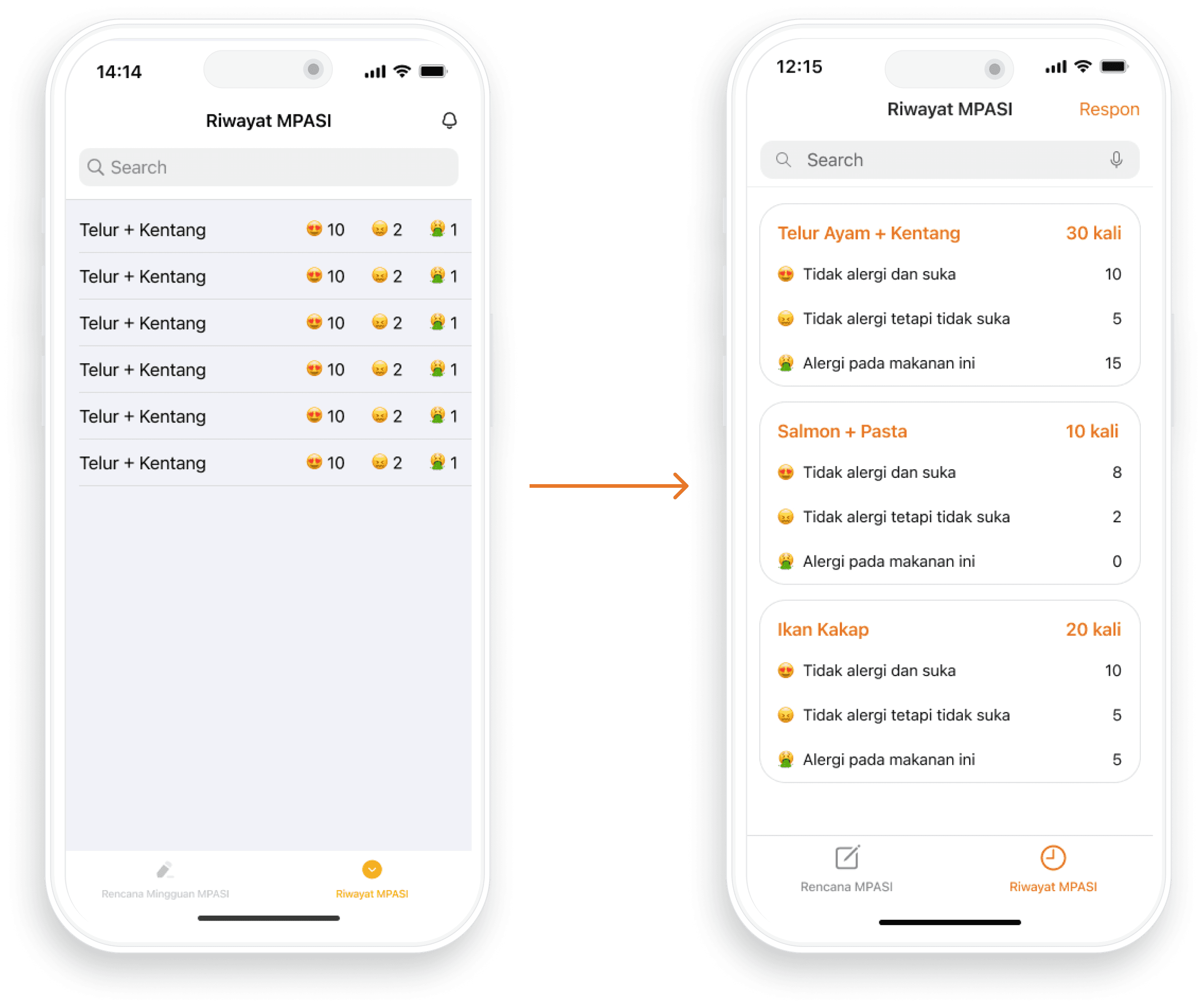
RIWAYAT MPASI
Enhanced user understanding by adding descriptions to each reaction.
The total ingredients provision was added to provide more context.
For clarity, the notification icon has been replaced with the text "Beri Respon."
MENU DETAIL
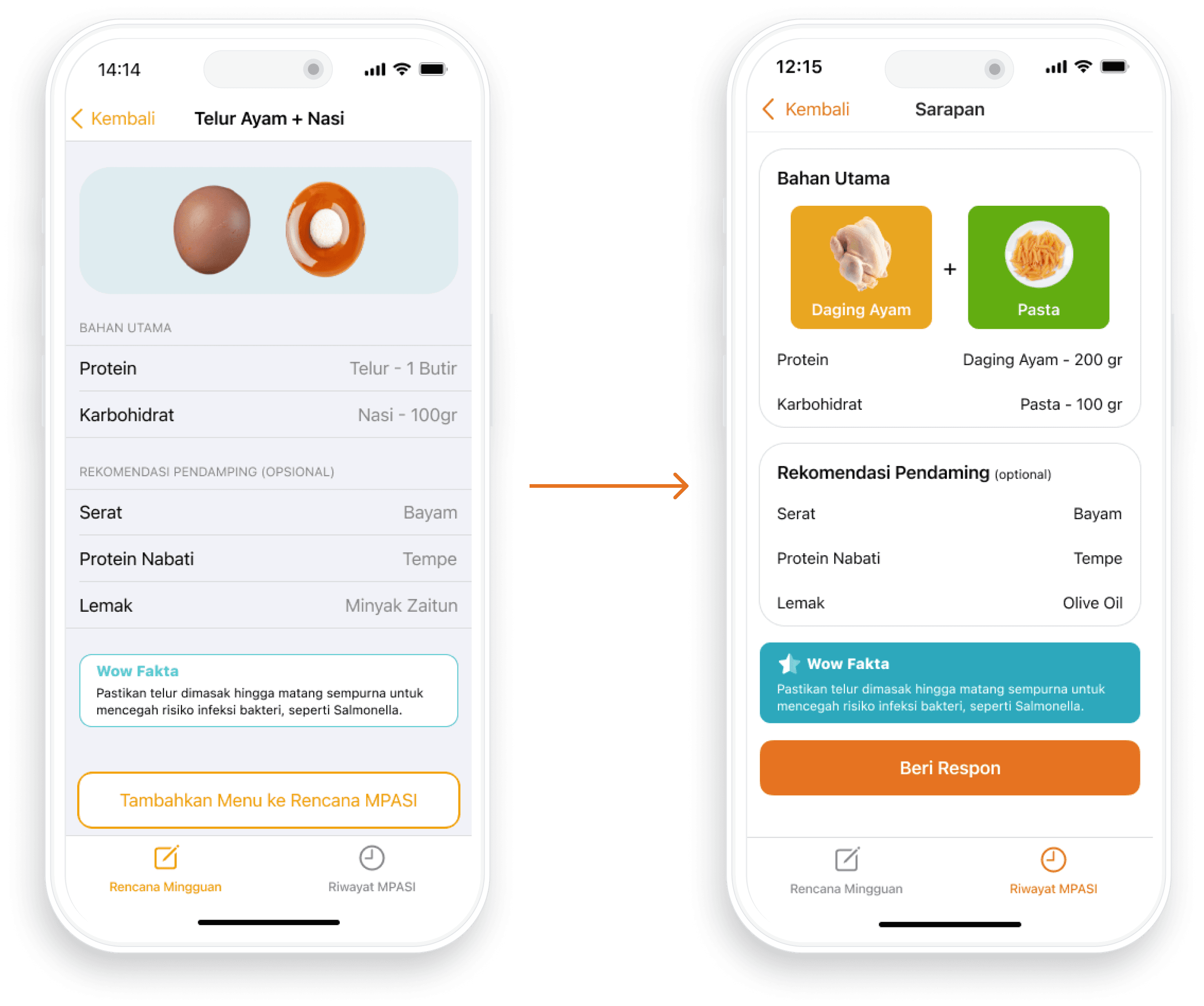
Refined the information hierarchy to ensure that users can readily grasp the information presented
Refined the layout to enhance user understanding
BERI RESPON
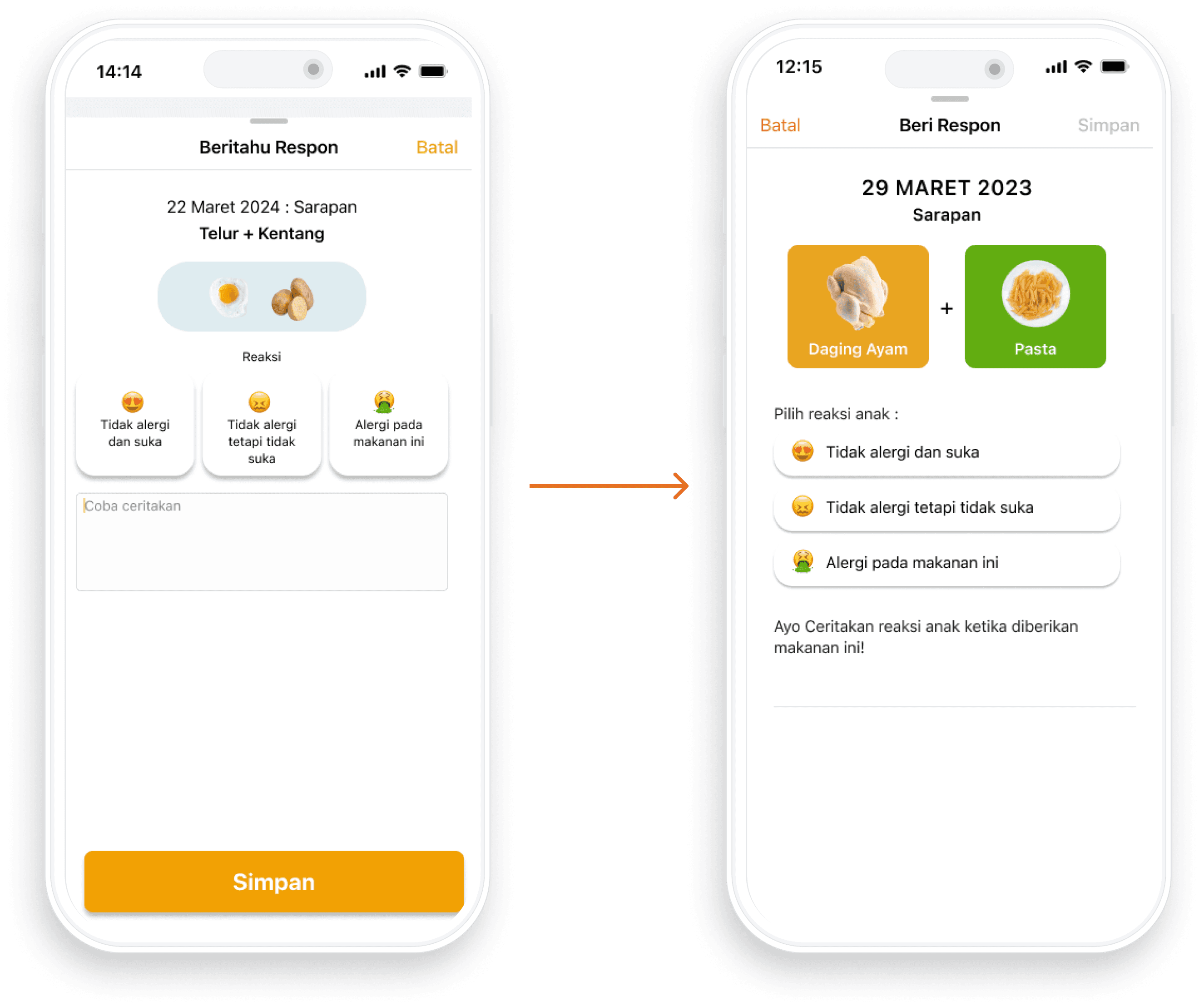
Improved information hierarchy and layout ensure a more organized and user-friendly interface
Add Descriptive text to enhance understanding
DETAIL RIWAYAT MPASI
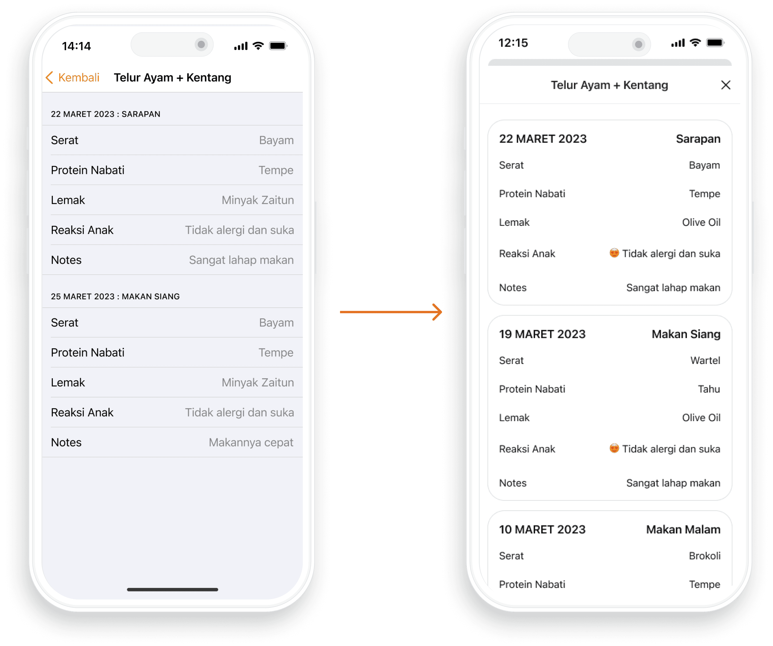
Improved information hierarchy and layout ensure a more organized and user-friendly interface
Transform the page into a modal sheet to streamline the flow and simplify the user interface.
BERI RESPON
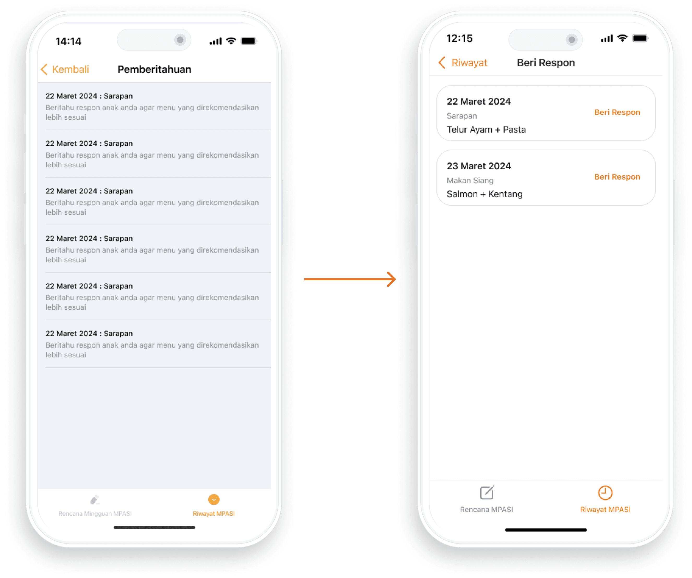
Add a "Beri Respon" button to clarify the card's purpose
Replacing the term "Pemberitahuan" for better context and relevance.
A/B TESTING
I conducted A/B testing, involving 5 participants for each design, to assess improvements in user experience by comparing the original and redesigned versions. The findings revealed that users expressed increased happiness and found the information more accessible with the redesigned interface. While these positive outcomes validate the success of the changes, user feedback has also pinpointed specific areas that require further refinement to enhance overall usability and satisfaction.
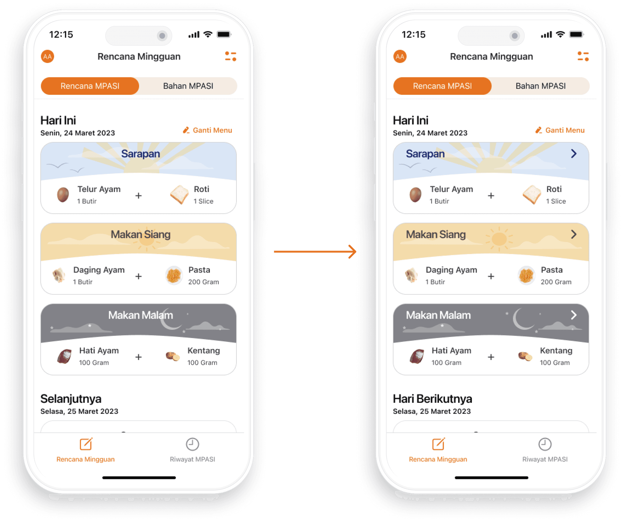
RENCANA MINGGUAN
From the A/B testing, I found that users were not aware that certain areas could be clicked to access more detailed information. As a result, I have incorporated chevron icons to make this interaction clearer and more intuitive for users.
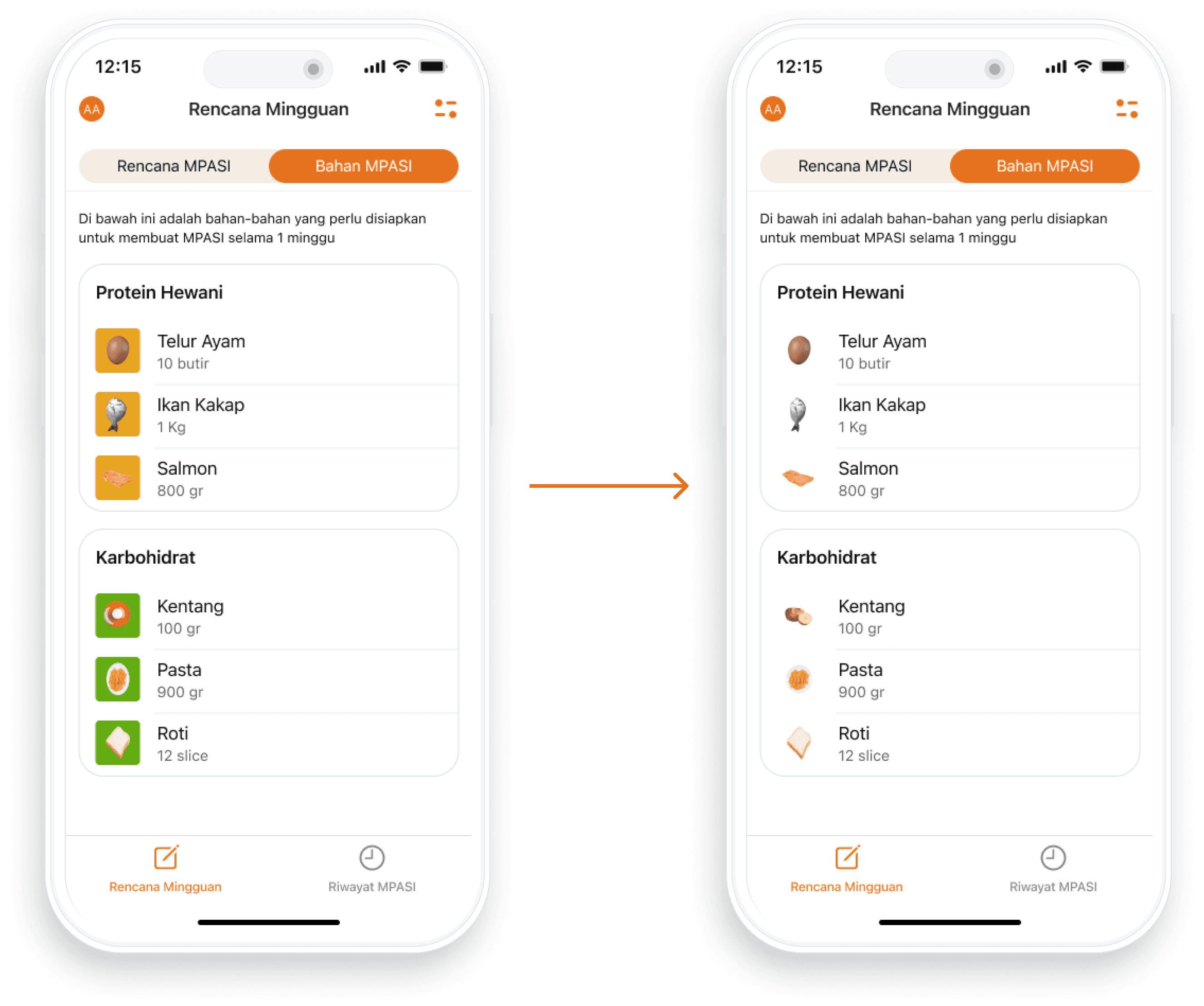
BAHAN MPASI
I've received feedback indicating that the background in the image was affecting its clarity. So, I've decided to remove the background, improving the overall visibility and focus of the image.
BAHAN MPASI
Add Descriptive text to enhance understanding
Improved the layout for easy comprehension
Categorized information for clarity and more organized

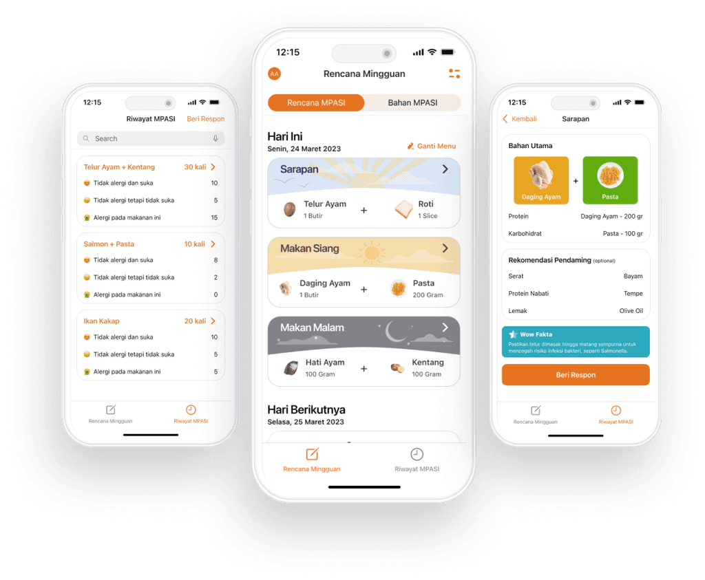
FINAL REDESIGN
