PROJECT OVERVIEW
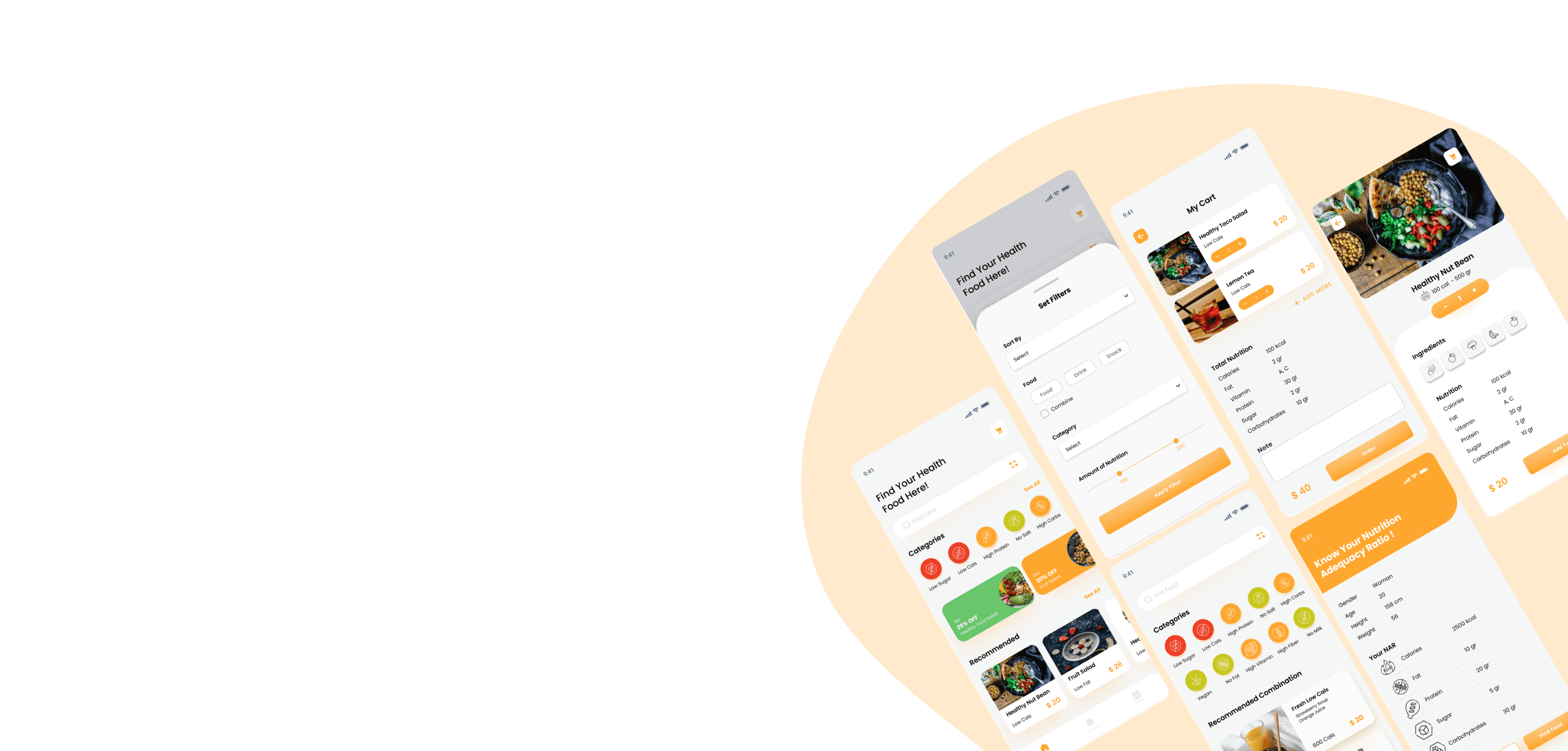
This is an application that is used to order food and calculate nutrition on the menu in cafes that sell healthy food. Customers can find out what nutrients are contained in a menu so that they can manage nutritional adequacy numbers and control their dietary habit. This application will show the amount of nutrients, such as calories, fat, carbohydrates, vitamins, proteins and sugars in the food or drink.
THE PROBLEM
People can't find food that they want to eat because they have health problem or they want to control their daily nutrition
MY ROLE
UX designer designing for food ordering app
from conception to delivery
RESPONSIBILITIES
Conducting research, interviews, paper and digital wireframing, low and high-fidelity prototyping, conducting usability studies, accounting for accessibility, and iterating on designs
Understanding The User
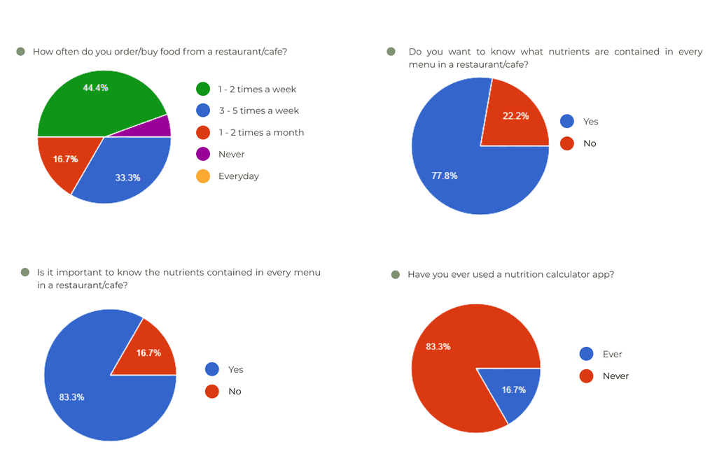
I conducted a survey to understand the users I’m designing for and their needs. A primary user group identified through research was are cafe visitors who have to pay attention to the amount of nutrients contained in the food they want to eat.
USER PAIN POINTS
Users find it difficult to find foods that match their daily nutritional needs
Users find it difficult to determine whether a food is in accordance with their daily nutritional needs
User wants to know whether the food consumed is good or not for their health
PERSONA
Paulina is someone who is following a diet program who needs to control the number of daily calories she consumes because She want to lose weight

Age
Education
Hometown
Family
Occupation
: 22
: University Student
: Jakarta, Indonesia
: Lives With Parents
: Full Time Students
Paulina
“I want to lose weight, so I have to eat low calorie food”
Paulina is a student who is following a diet program that requires her to control the number of daily calories she consumes. Paulina often finds it difficult to get ombination of food and drinks that have the required number of calories, so she needs an application that can recommend the combination food/drinks/desserts with the desired number of calories.
Goal
Application that can select food according to the desired amount of nutrients
Application can provide food/drink/dessert recommendations with the desired number of calories
Frustation
It's hard to find foods that match the calories needed
Difficult to get combination of food and drinks that have the required number of calories
USER JOURNEY MAP
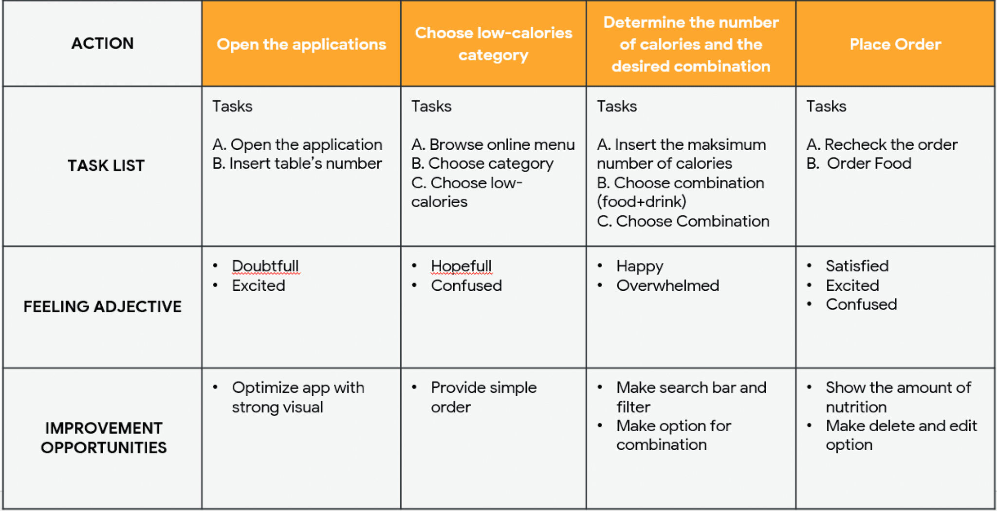
Mapping Paulina’s user journey revealed how helpful it would be for users to have access to a dedicated Food Ordering App
COMPETITIVE AUDIT
I Identified the competitors and analyzed their bussiness strategies to determine their strength and weakness relatives to this food ordering App. See the result and report.
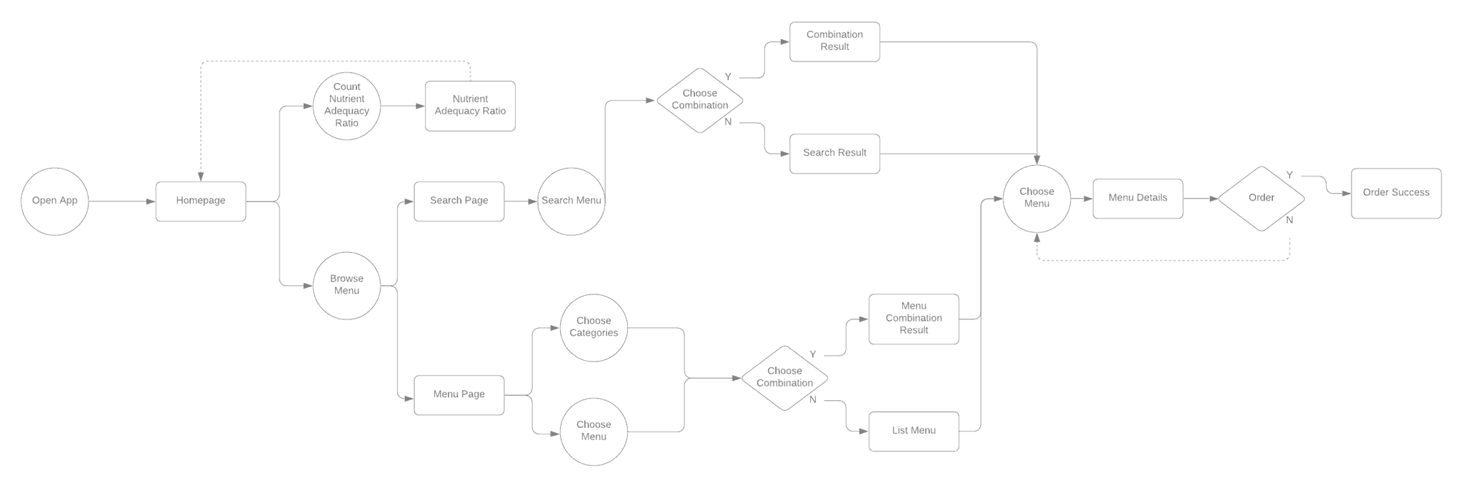
USER FLOW
A user flow is a path taken by a user on an app or website so they can complete a task from start to finish.
Design
STORYBOARD
To outline an ideal flow for my design, I sketch two types storyboard on a piece of paper such as Big picture storyboards and Close-up storyboards

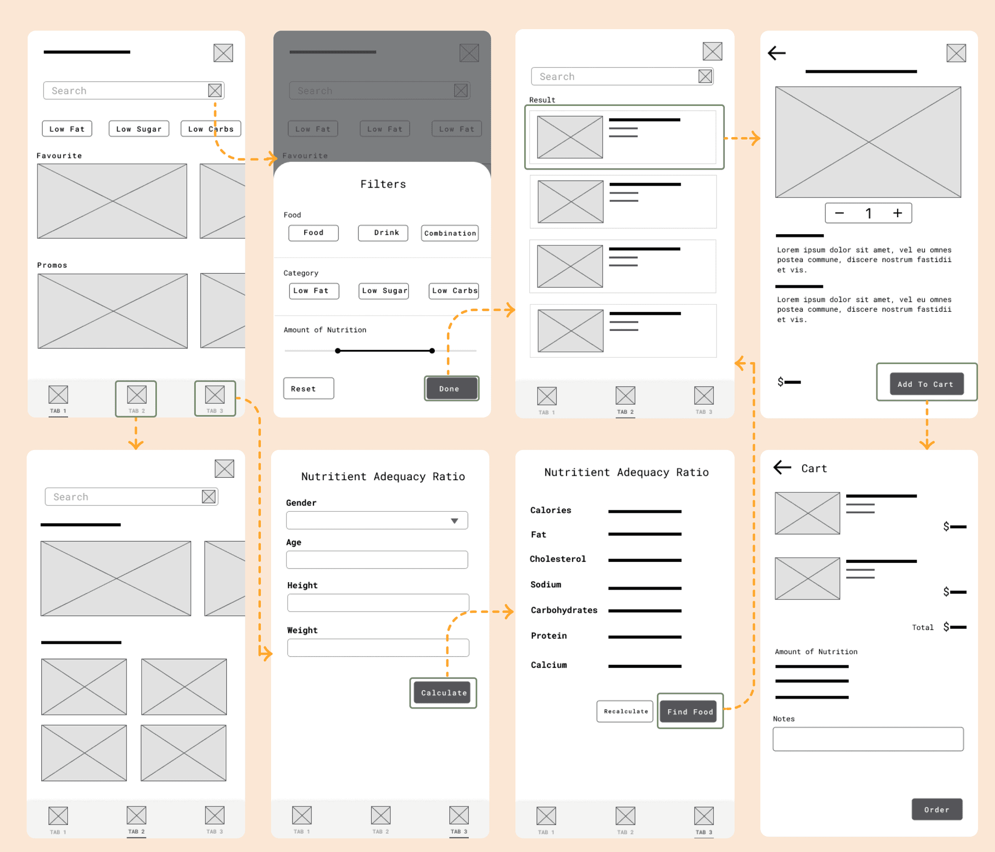
LO-FI PROTOTYPE
Using the completed set of digital wireframes, I created a low-fidelity prototype. The primary user flow I connected with was choosing and ordering food with desired nutrients, so the prototype could be used in a usability study. See the full prototype here.
FIRST USABILITY STUDY
The Low-Fidelity prototype was used in an unmoderated usability study with 5 participants. See the first usability study plan here.
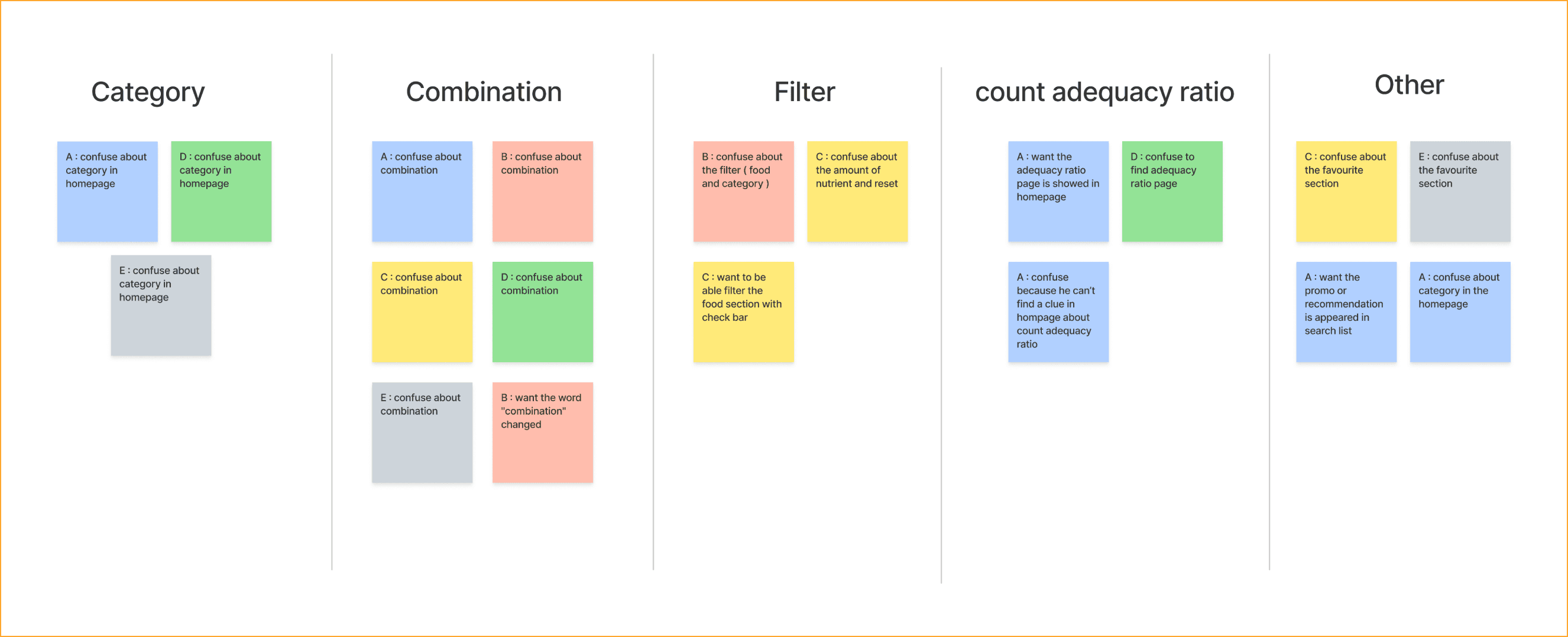
AFFINITY DIAGRAM
I create an affinity diagram that helps me group together research insights so that I can further understand and define the problems in this application.
INSIGHT
Using the completed set of digital wireframes, I created a low-fidelity prototype. The primary user flow I connected with was choosing and ordering food with desired nutrients, so the prototype could be used in a usability study.
User want to order combination food easily and combine the food they want
User don’t understand what is in the tab before they click it
Category must be clearly shown so that user can understand what is in the category
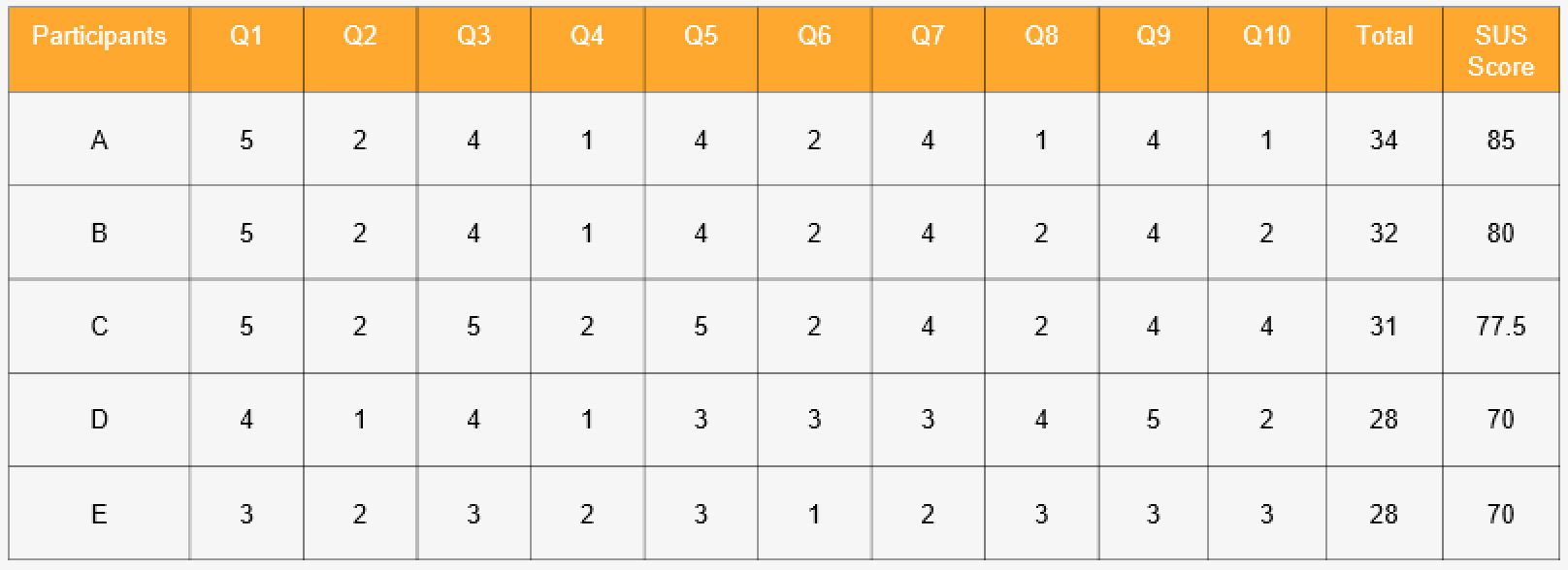
SYSTEM USABILITY SCALE
The final score of the Food ordering App using the SUS questionnaire is 76.5% and is in the Good category.
REFINING THE DESIGN
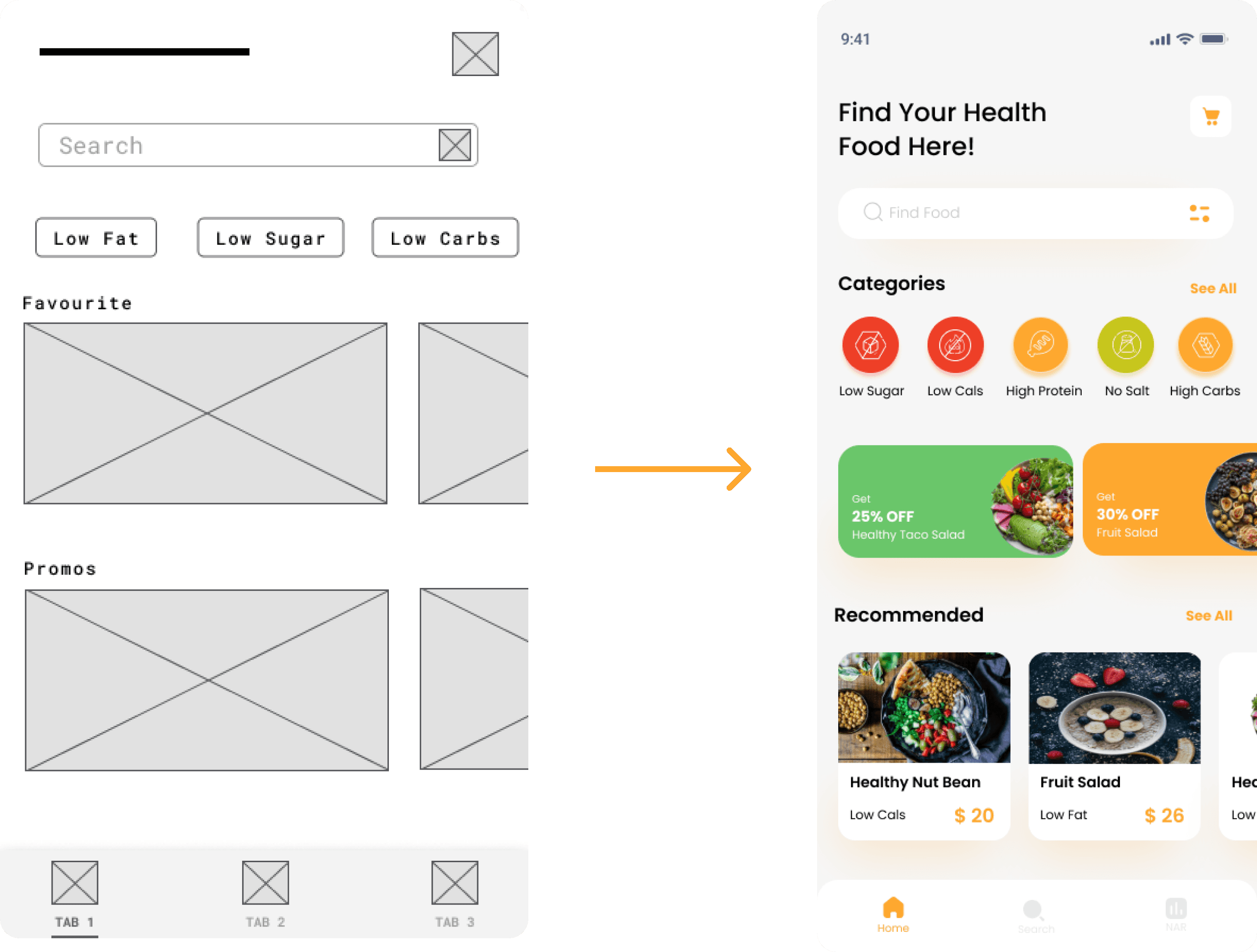
Early designs shows category in tab form but after the usability studies, I added an icon so that user more understand about category, I also delete favorite section because user confuse about it and it’s not a urgent feature.
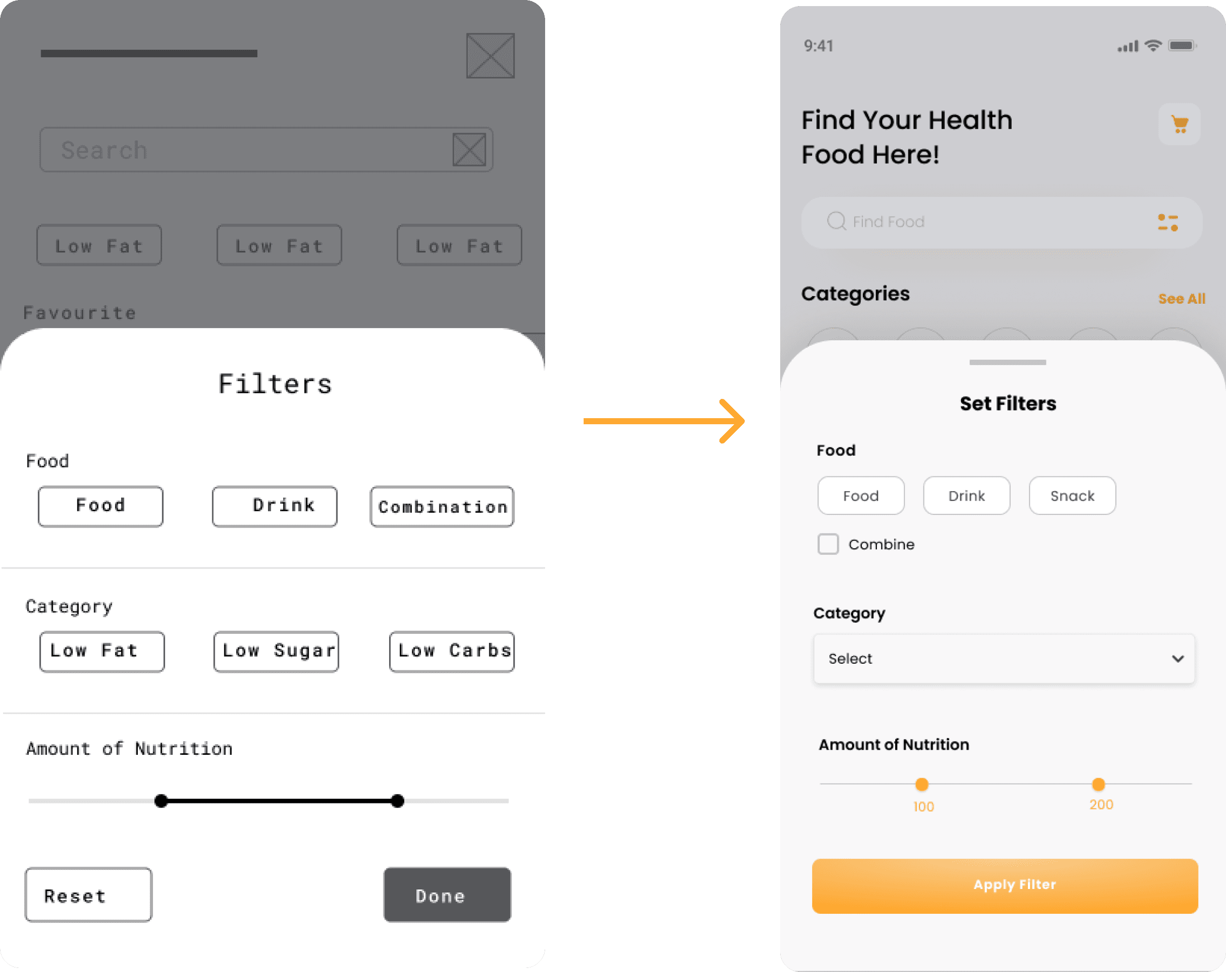
First usability study revealed frustration with the find food flow. User confuse about combination, so I made a checkbox so that it can be more understandable.
SECOND USABILITY STUDY
The second usability study used a high-fidelity prototype and revealed what aspects of the mockups needed refining. See the second usability study plan here.
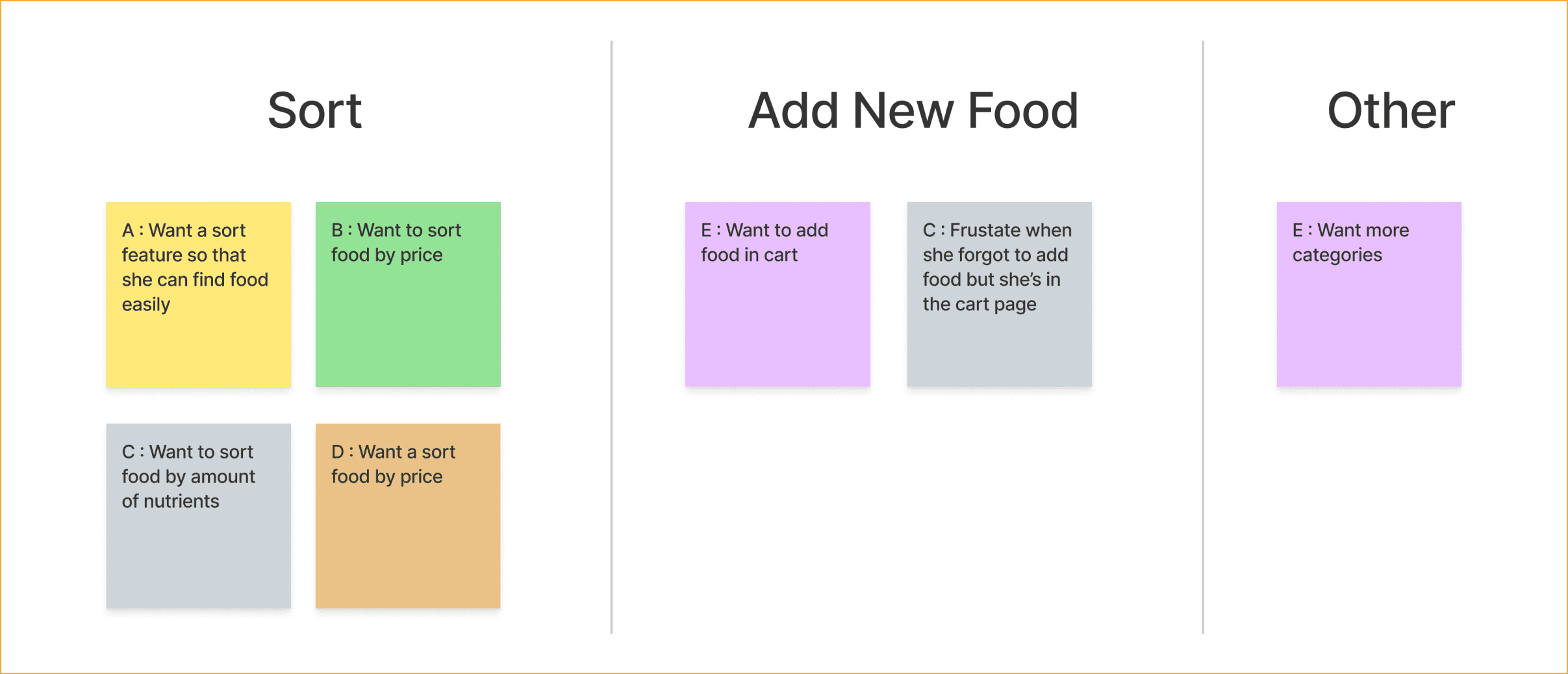
AFFINITY DIAGRAM
I create an affinity diagram that helps me group together research insights so that I can further understand and define the problems in this application.
INSIGHT
I create an affinity diagram that helps me group together research insights so that I can further understand and define the problems in this application.
User want to add another order in cart
User want to be able sort the search result
REFINING THE DESIGN
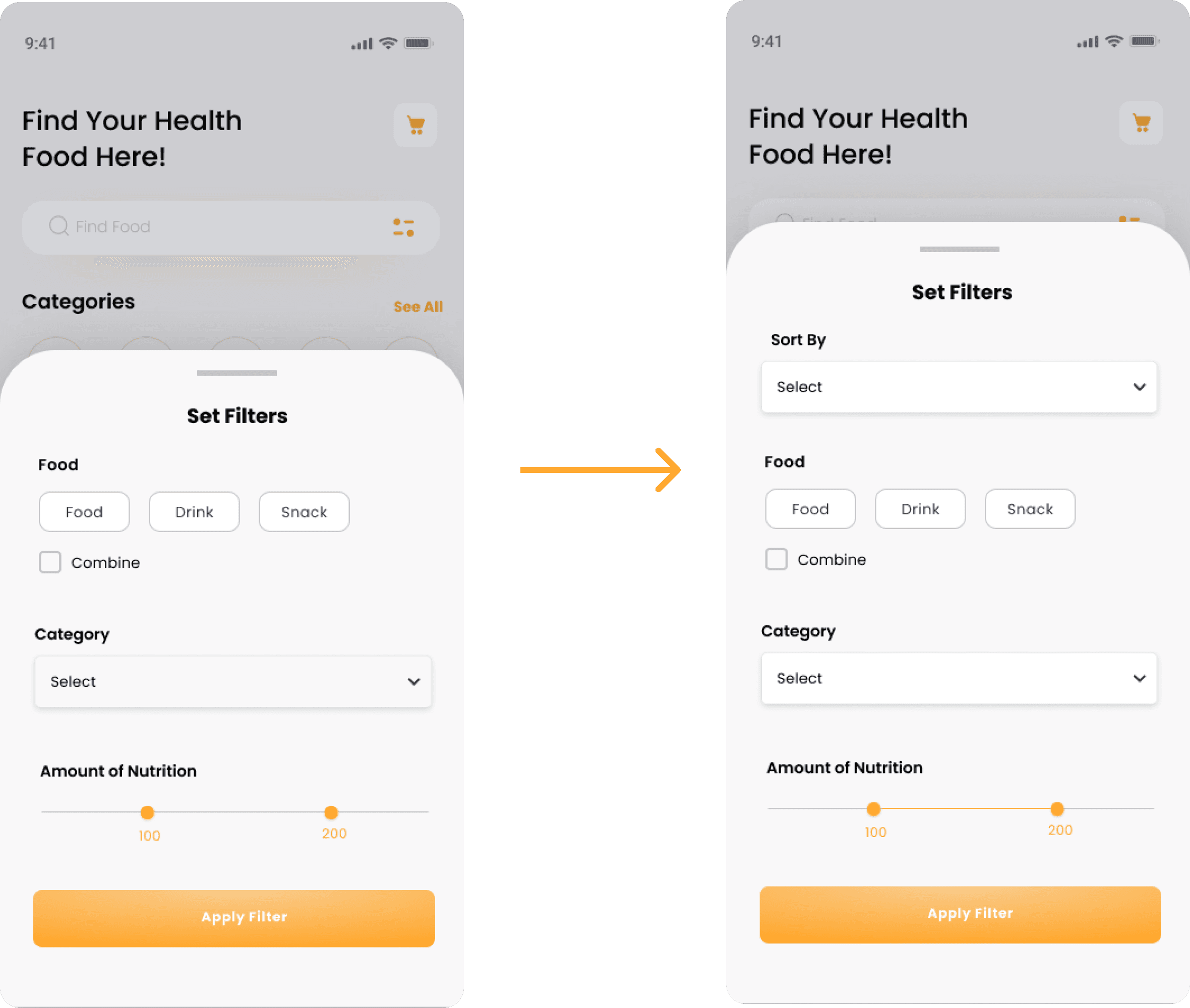
Based on the insights from the usability study, I made changes to improve the flow.
The second usability study revealed frustration with Sort. User want to sort food so that they can easily choose food they want.

Users want to add some more food even though they already have food in their cart, so I added an "add food" button in the cart
FINAL HIGH - FIDELITY PROTOTYPE
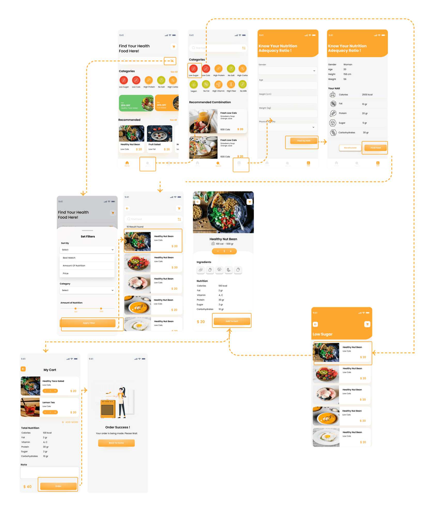
The final high-fidelity prototype presented cleaner user flows for building a food order and checkout. It also met user needs for combination food. See the High-Fidelity Prototype here.
ACCESIBILITY CONSIDERATION
Provided access to users who are
vision impaired through adding alt
text to images for screen readers.
Used icons to help make
navigation easier.
Used detailed imagery for category and ingredients to help all users
better understand the designs.
GOING FORWARD
IMPACT
The app makes users feel like the Food Ordering App thinks about how to meet their needs
One quote from peer feedback:
“This application is very helpful for me because I often don't know what kind of food I eat or whether the food is by the amount of nutrition I need. This App helps me know which foods that are suitable for me.”
NEXT STEP
Conduct another round of usability studies to validate whether the pain points users experienced have been effectively addressed
Conduct more user research to determine any new areas of need.
WHAT I LEARNED
While designing the Food Ordering App, I learned that the first ideas for the app are only the beginning of the process. Usability studies and peer feedback influenced each iteration of the app’s designs.
